Fit Bike

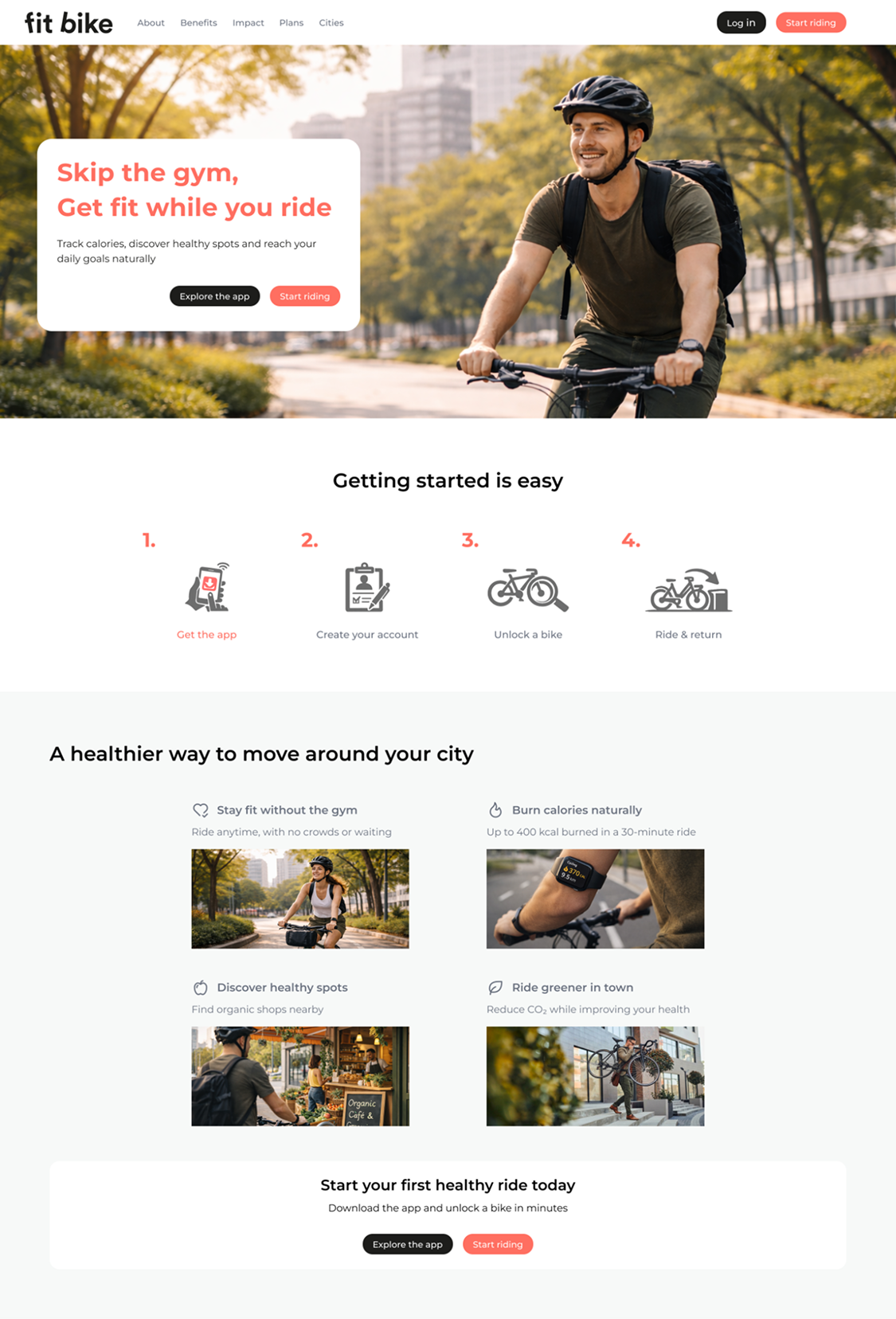
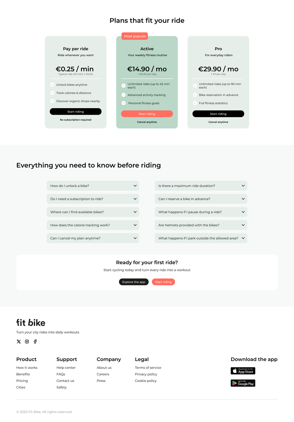
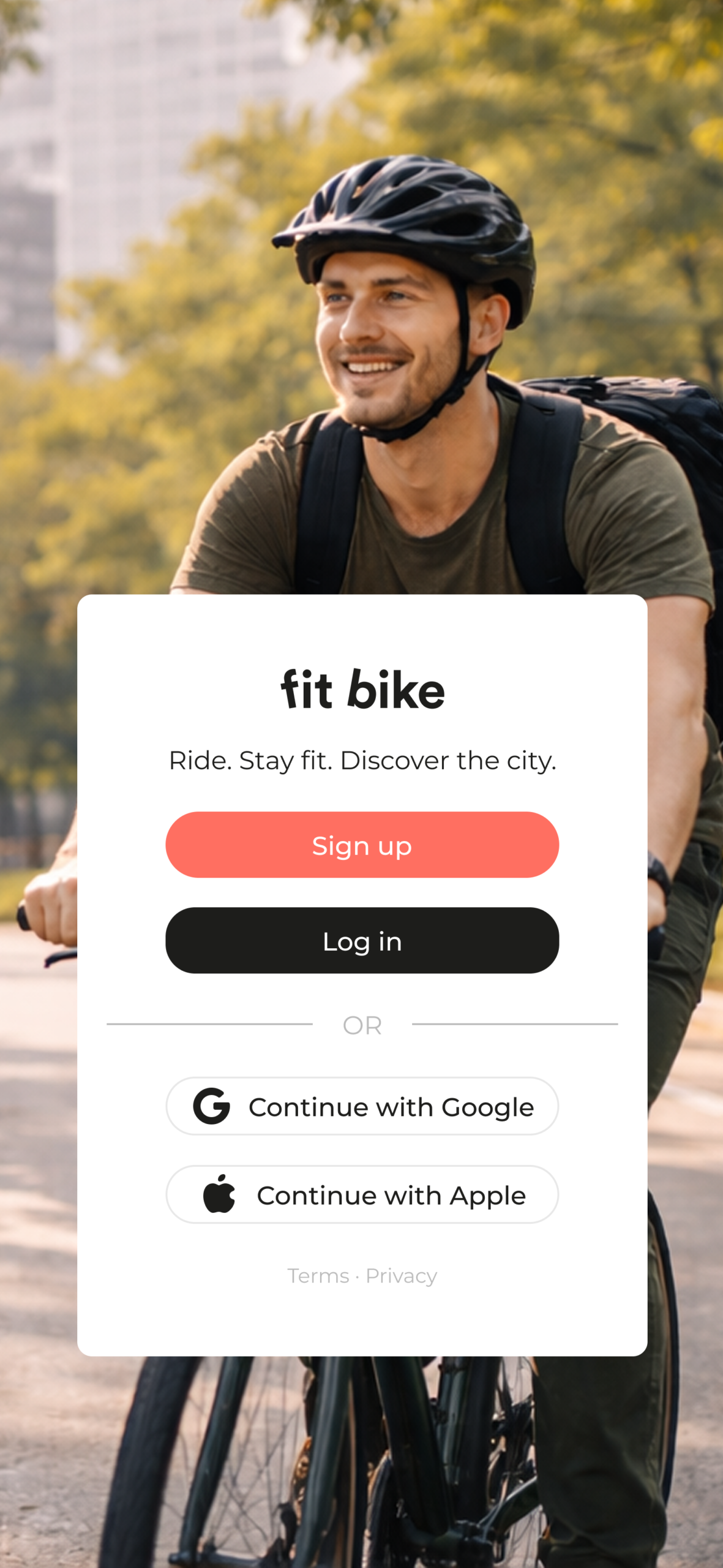
Redesigning the digital experience of a bike-sharing platform focused on health and everyday mobility​

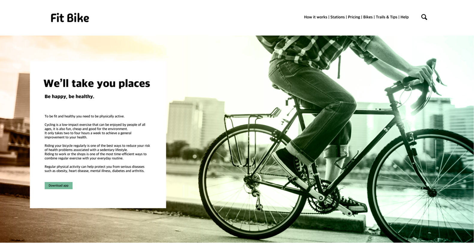
Fit Bike offers a bike-sharing service designed for people who want to stay active without relying on crowded gyms. However, the original website lacked a clear structure, strong calls-to-action, and an effective way to communicate the service’s benefits.

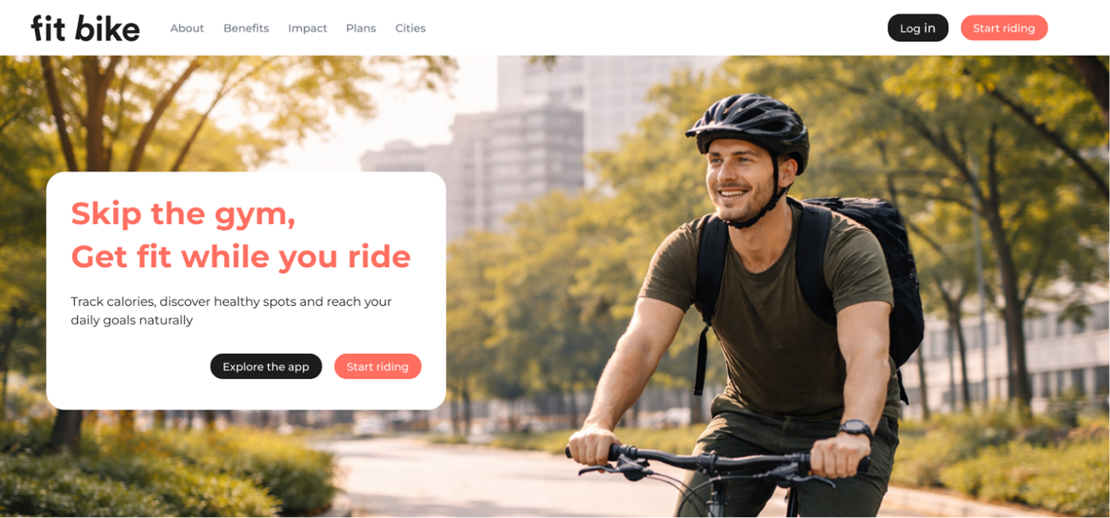
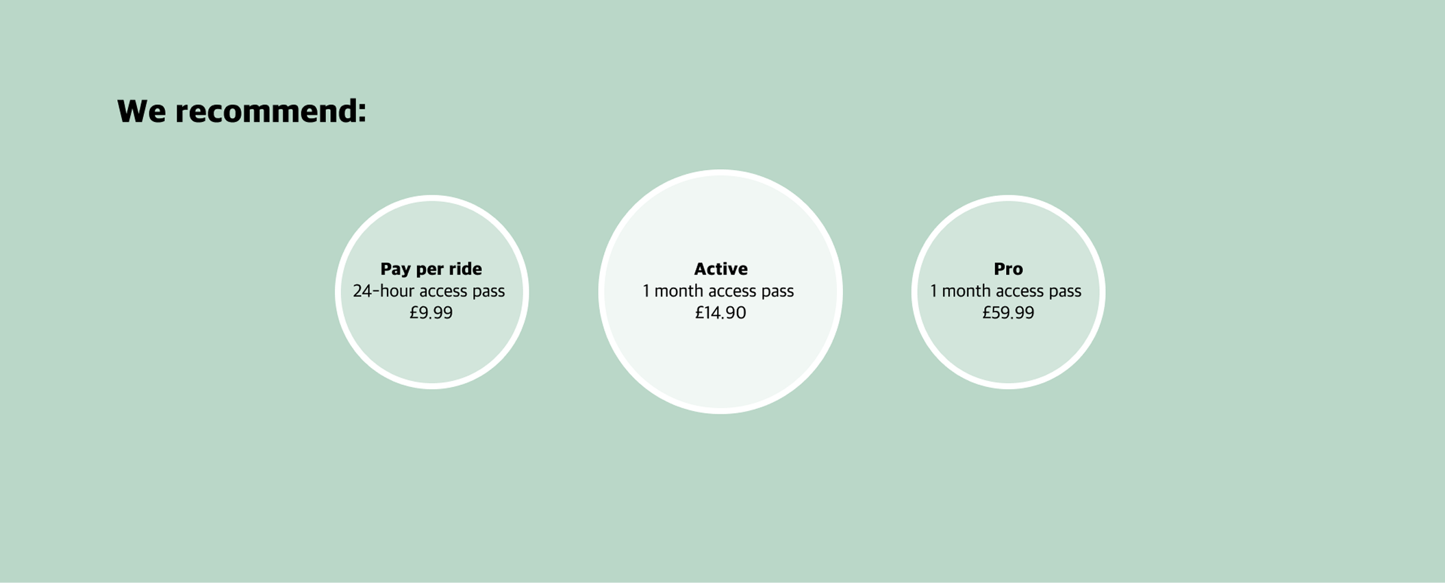
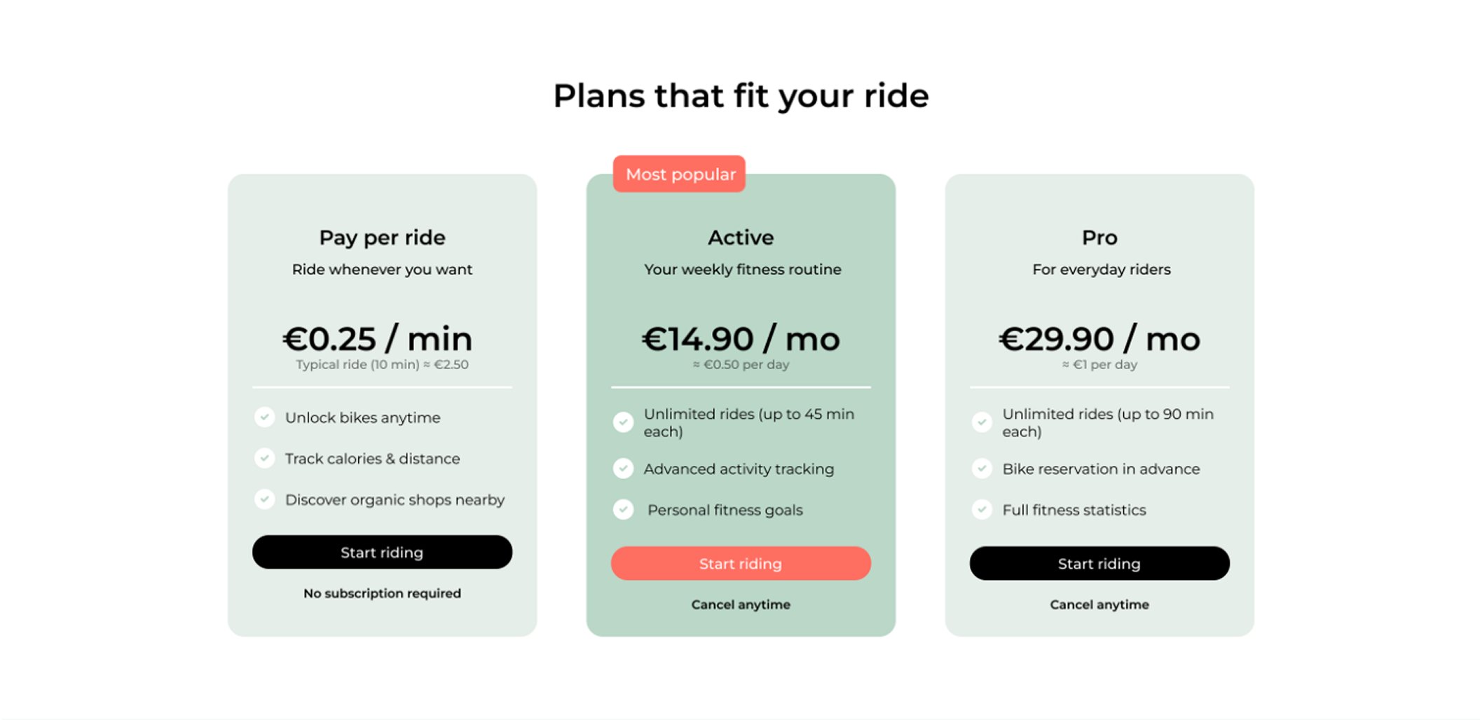
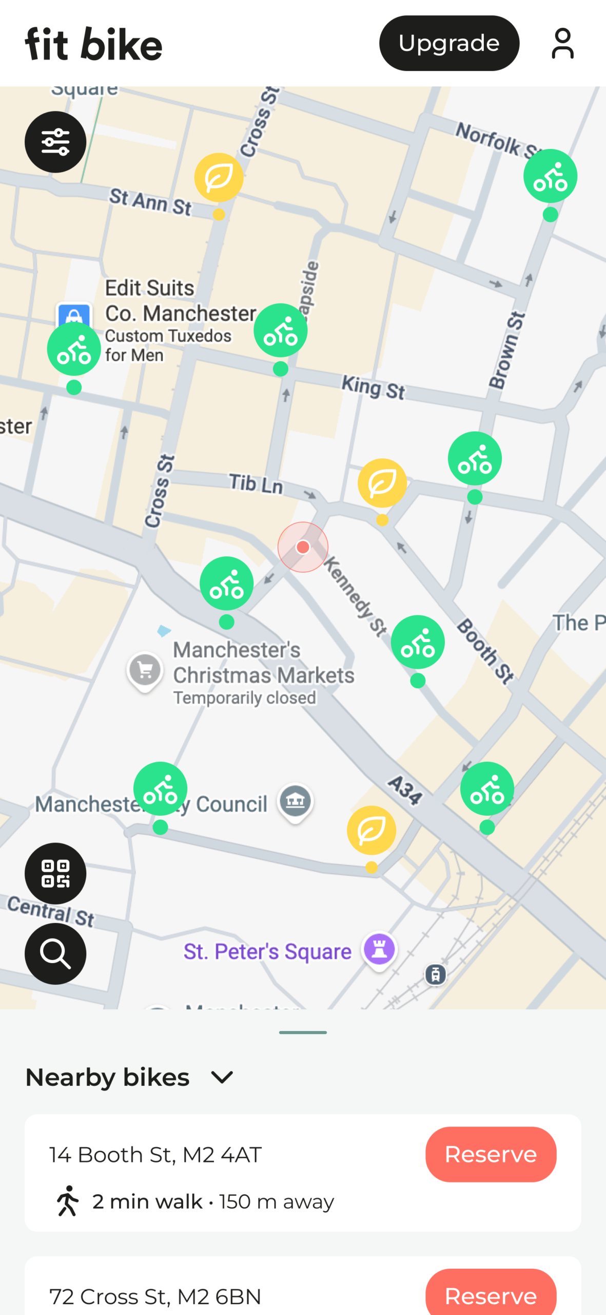
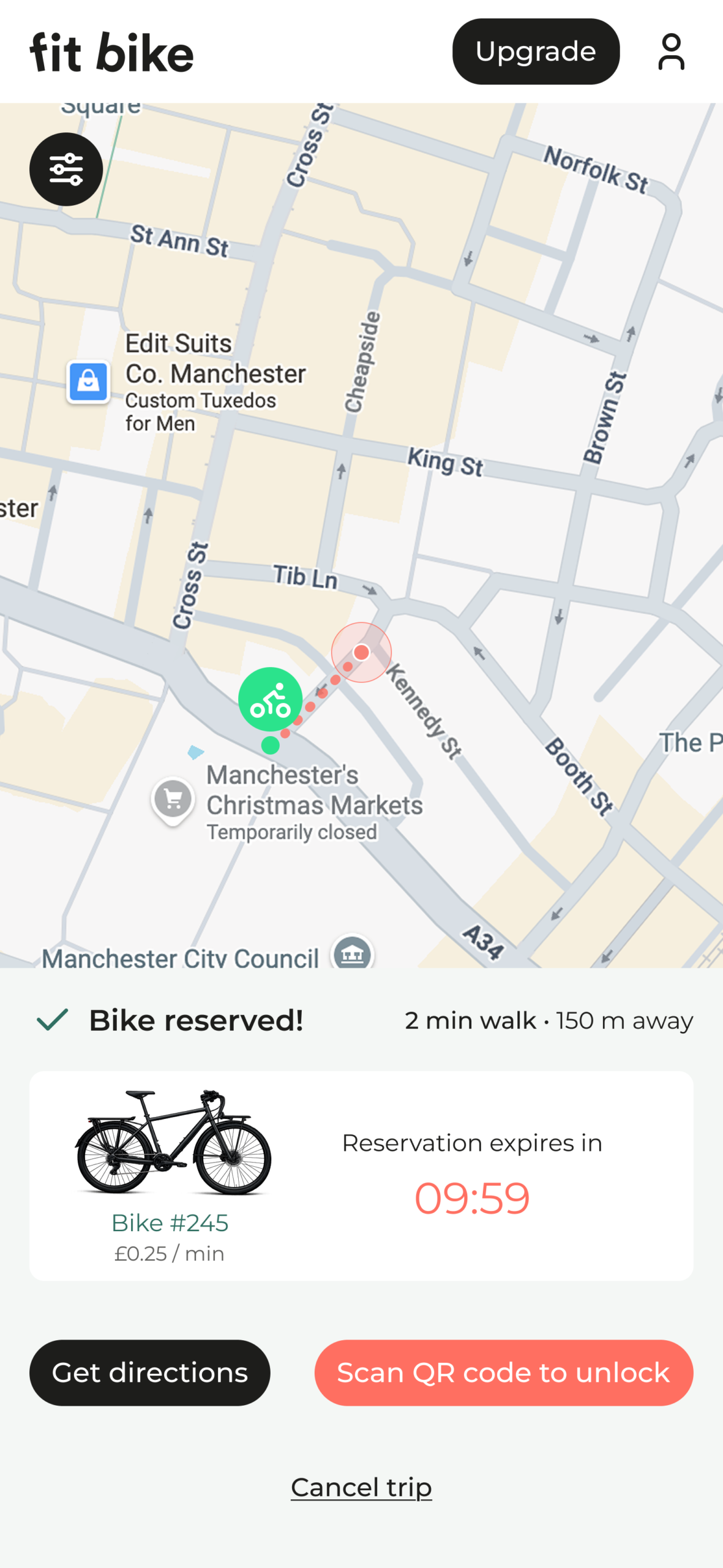
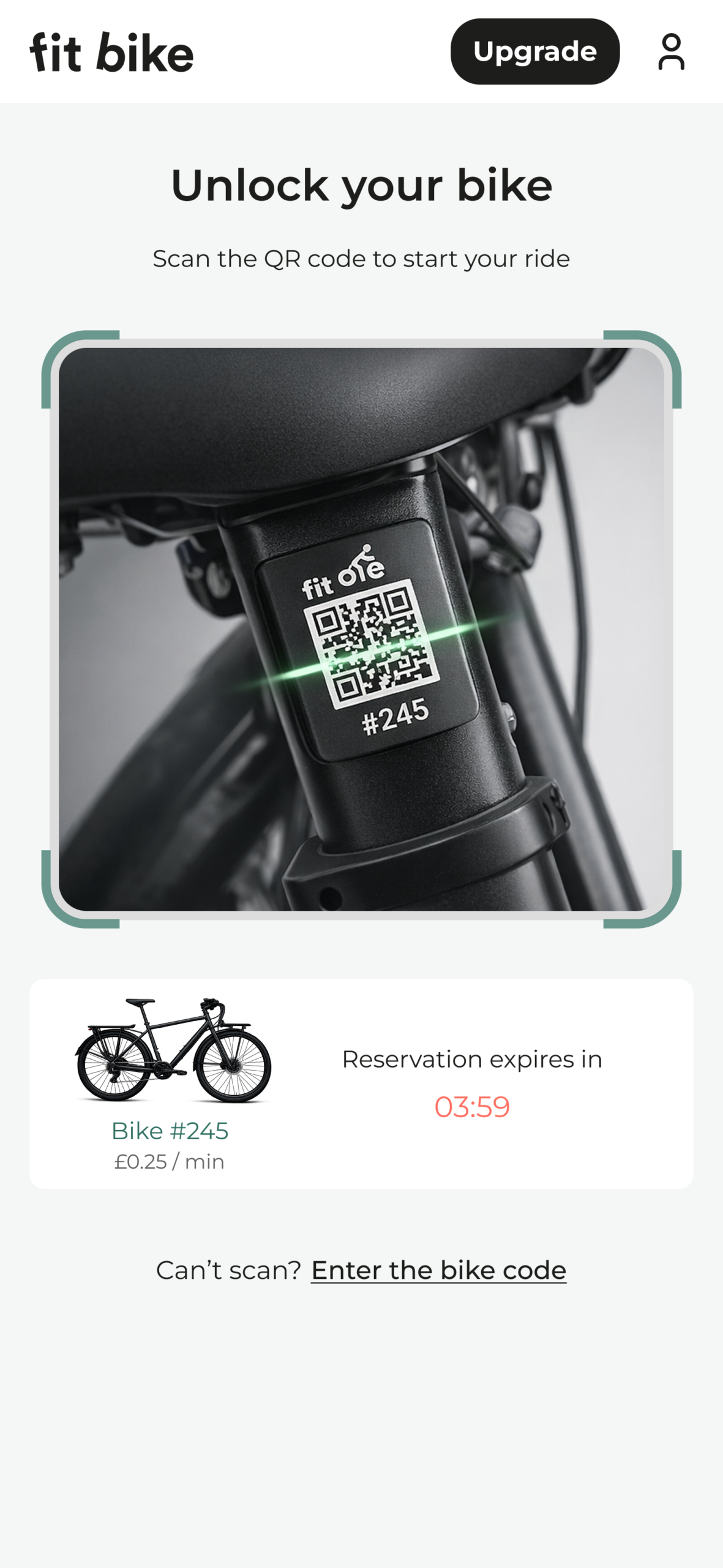
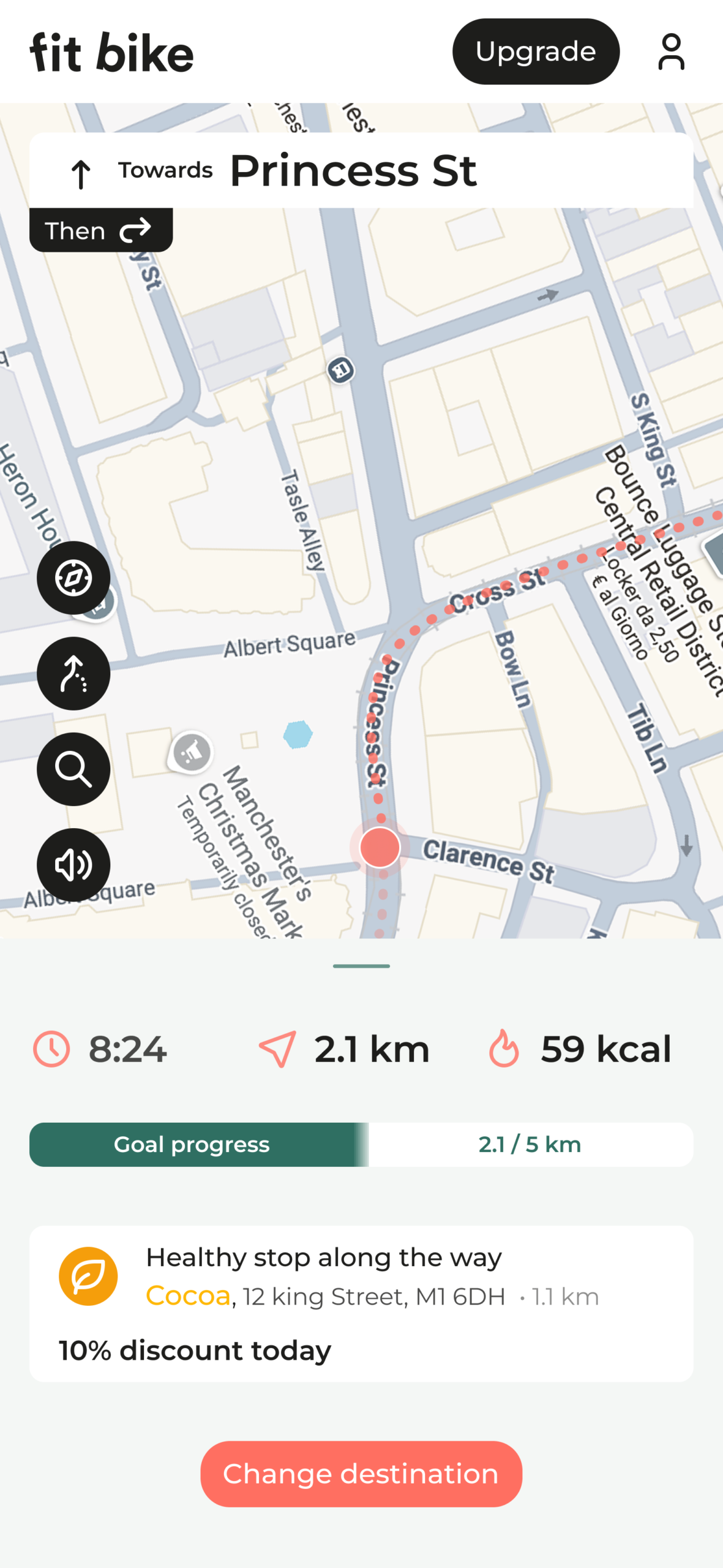
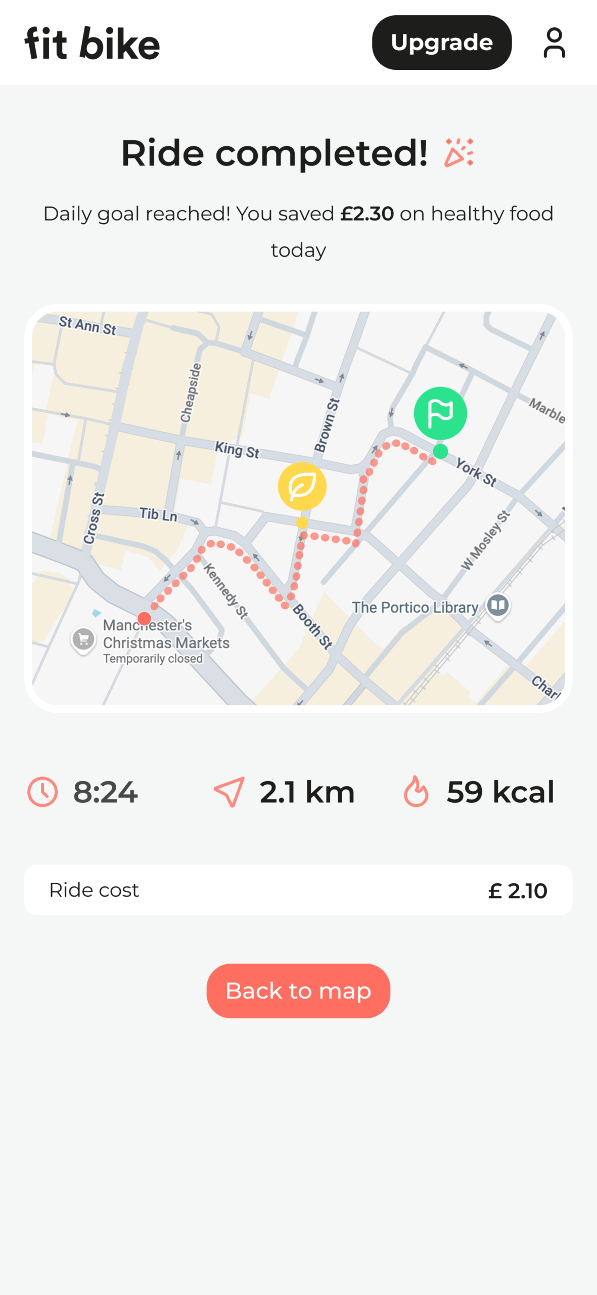
The redesign focused on improving usability, accessibility, and content hierarchy while introducing a clearer brand identity and a more engaging user journey. The new design focuses on guiding users through the service, explaining how it works, highlighting its health benefits, and making it easier to start riding.

The result is a cleaner, more intuitive experience that supports user decision-making and encourages engagement with the platform.

THE PROBLEM

• Users struggled to quickly find available bikes nearby
• The booking flow required too many steps
• Pricing plans were unclear and hard to compare
• The interface lacked visual hierarchy and clarity

MY ROLE

• Brand identity and logo redesign
• UX audit of the existing website
• Information architecture restructuring
• Website UX/UI redesign
• CTA optimization and conversion improvements
• Accessibility and readability improvements
• High-fidelity prototyping

THE RESULT

• Clearer communication of the service value proposition
• Improved navigation and content hierarchy
• Increased visibility of primary actions and CTAs
• A more modern and consistent visual identity
• Simplified pricing comparison and decision process
• Reduced cognitive load through clearer layouts and structure

SERVICES

UX/UI Design · UX Audit · Brand Identity · Website Redesign · Prototyping · Usability Testing

TOOLS

Figma · FigJam · Jira · Adobe CC · Notion · Google Drive

COLLABORATORS

Stakeholders · Product Team · Operations · Store Staff · Developers

PROJECT DURATION

3 Months

Operational architecture

Designing not only the interface, but the operational logic behind it

check 1

Reduced friction in onboarding flow

Clear guidance for first ride activation

check 1
check 1

Simplified tracking of rides and fitness

Immediate visibility on activity data

check 1

Hero section

Redesigning the first impression to clearly communicate value and drive action

BEFORE

  • Long descriptive paragraph

  • Weak call-to-action

  • Unclear value proposition

AFTER

  • Clearer value proposition

  • Stronger CTA visibility

  • Secondary CTA to explore the app

  • Reduced text and improved readability

  • Stronger visual hierarchy

How the service works

Simplifying the user journey into clear and easy-to-follow steps

BEFORE

  • Generic benefits presented with limited context

  • Weak visual hierarchy between content elements

  • Decorative layout with low informational value

  • No clear call-to-action guiding users to start the service

AFTER

  • Clear benefit-driven content explaining the service value

  • Structured card layout improving content hierarchy

  • Imagery reinforcing the value proposition

  • Multiple CTAs encouraging users to start riding

Service Benefits

Highlighting the core value of the service through a clearer and more accessible interface

BEFORE

  • Generic benefits presented with limited context

  • Weak visual hierarchy between content elements

  • Decorative layout with low informational value

  • No clear call-to-action guiding users to start the service

BEFORE

  • Clear benefit-driven content explaining the service value

  • Structured card layout improving content hierarchy

  • Imagery reinforcing the value proposition

  • Multiple CTAs encouraging users to start riding

pricing Structure

Making pricing transparent and easy to compare at a glance

BEFORE

  • Pricing options presented in a visually unbalanced layout

  • Harder for users to compare plans and pricing at a glance

  • Limited information hierarchy between the available options

  • No clear feature breakdown to support decision-making

AFTER

  • Clear pricing comparison through card-based layout

  • Clear feature breakdown across plans

  • Highlighted recommended plan to guide decision-making

  • Clear CTA to start a plan

FAQ & support

Improving access to information and reducing user uncertainty

BEFORE

  • No FAQ section addressing common user questions

  • Users had to search for information across the page

  • Lack of support content for new users

  • Higher uncertainty before starting the service

AFTER

  • Dedicated FAQ section addressing common user questions

  • Accordion layout improving content scannability

  • Clear information about service rules and how the system works

  • Reduced user uncertainty before starting a ride

Footer Navigation

Enhancing navigation to make key sections easier to reach

BEFORE

  • Minimal footer with limited navigation options

  • Important information harder to access

  • No clear support or help resources

  • Limited guidance for users looking for additional information

AFTER

  • Structured footer with organized navigation sections

  • Clear access to product, support, and company information

  • Dedicated links to help center and FAQ

  • Easier access to app download and key sections

mobile App experience

Designing a fast and intuitive mobile experience for on-the-go users

check 1

Quick sign-up and login flow

check 1

Map-based bike discovery

check 1

Simple reservation and QR code unlock

Real-time ride tracking

check 1

Contextual health insights during ride

check 1

Clear trip summary at ride completion

check 1

Key outcomes

Impact of the redesign on usability, clarity, and user engagement

Strategic Outcomes

  • Improved clarity of the service value proposition across the website

  • Stronger information hierarchy enabling faster content scanning
  • Clearer onboarding flow helping users understand how the service works

  • Improved decision-making through simplified pricing comparison

  • Reduced user uncertainty thanks to the introduction of a dedicated FAQ section

Performance Impact

  • +27% increase in CTA engagement after improving visibility and hierarchy

  • +32% faster bike discovery and reservation flow

  • +21% improvement in pricing plan comparison and selection

  • −18% reduction in support-related user questions after introducing FAQs

  • Higher user engagement across the redesigned landing page