Designing a guided wine discovery experience that helps users identify their taste profile through aroma-based selection
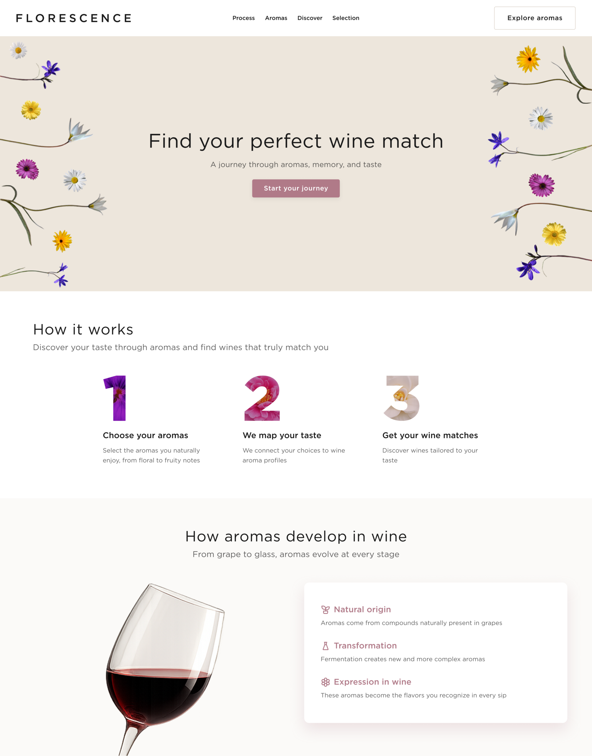
Florescence is a guided wine discovery platform designed to help users identify their taste profile through a visual, aroma-based system. By translating complex wine characteristics into intuitive color-coded cues, it makes exploration more accessible and engaging.
A short onboarding flow defines user preferences and generates personalized recommendations, allowing users to discover, compare, and choose wines more easily without relying on technical knowledge.
MY ROLE
• Designed the end-to-end user experience from concept to final solution • Translated complex wine knowledge into intuitive interaction patterns • Defined information architecture and user flows • Developed a visual and interaction system to support guided discovery
THE RESULT
• Simplified the wine selection process through a more intuitive experience • Enabled faster and more confident decision-making • Improved accessibility for users with different levels of expertise • Delivered a scalable and engaging product experience
SERVICES
UX/UI Design · Information Architecture · Visual Design · Wireframing · Prototyping · Responsive Design · WordPress Development
TOOLS
Figma · FigJam · Notion · Adobe CC · WordPress
COLLABORATORS
Product Owner · Stakeholders · Developers
PROJECT DURATION
4 Months
Homepage
Building a scalable system to ensure consistency across features and content
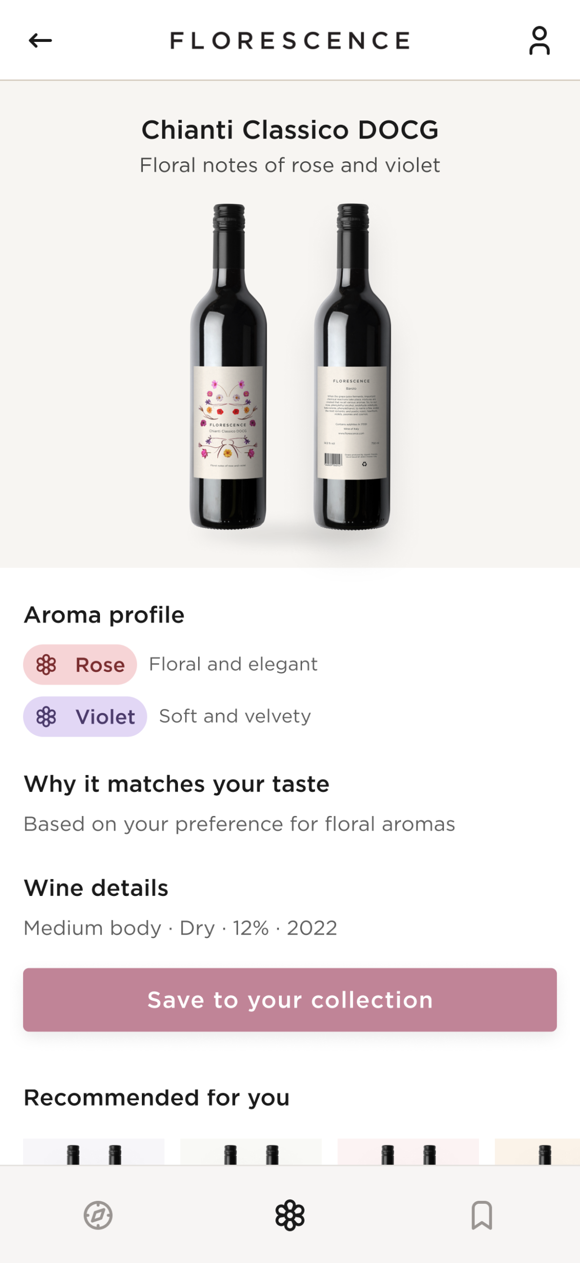
The homepage introduces Florescence as a guided wine discovery tool, focusing on visual taste exploration.
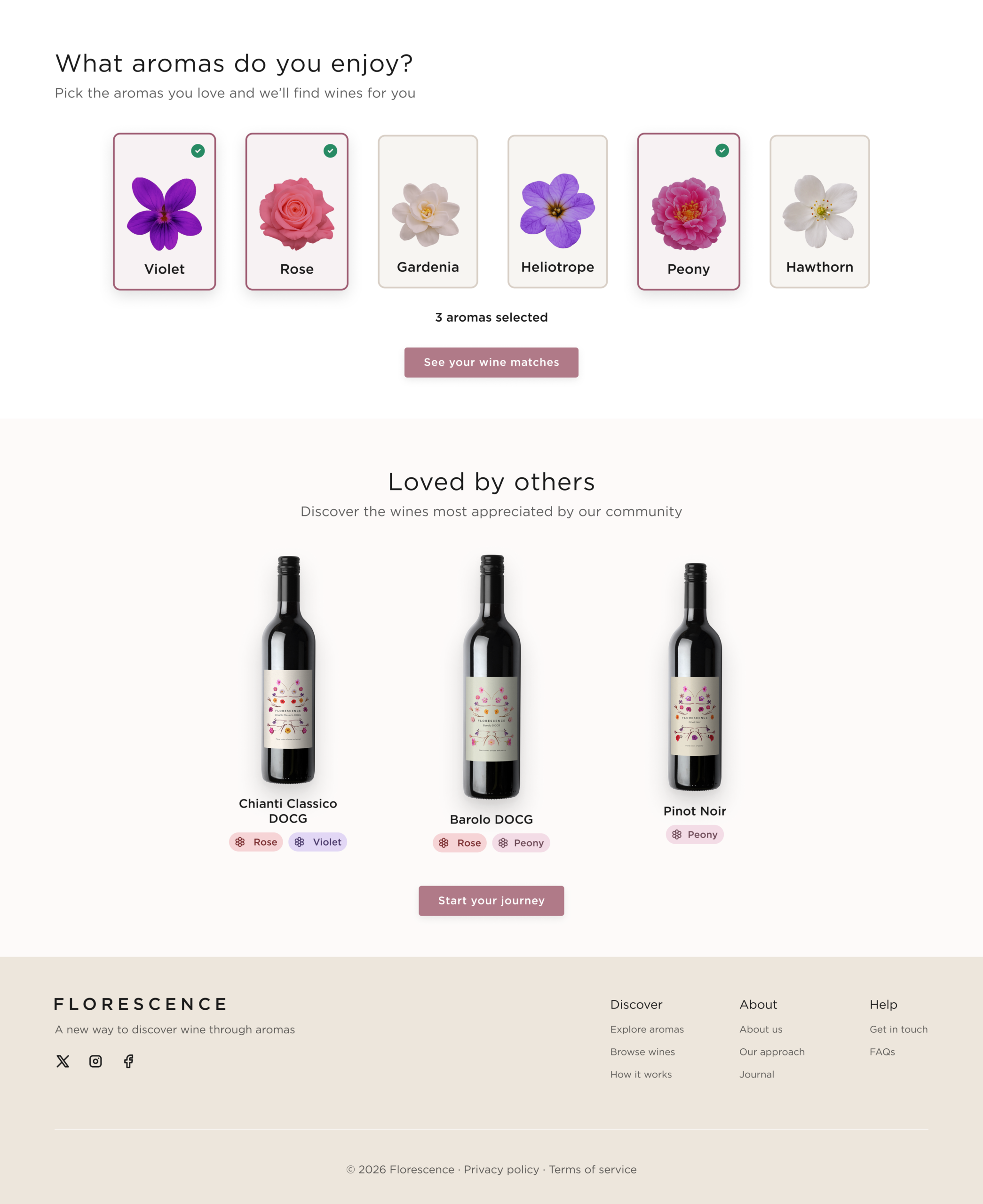
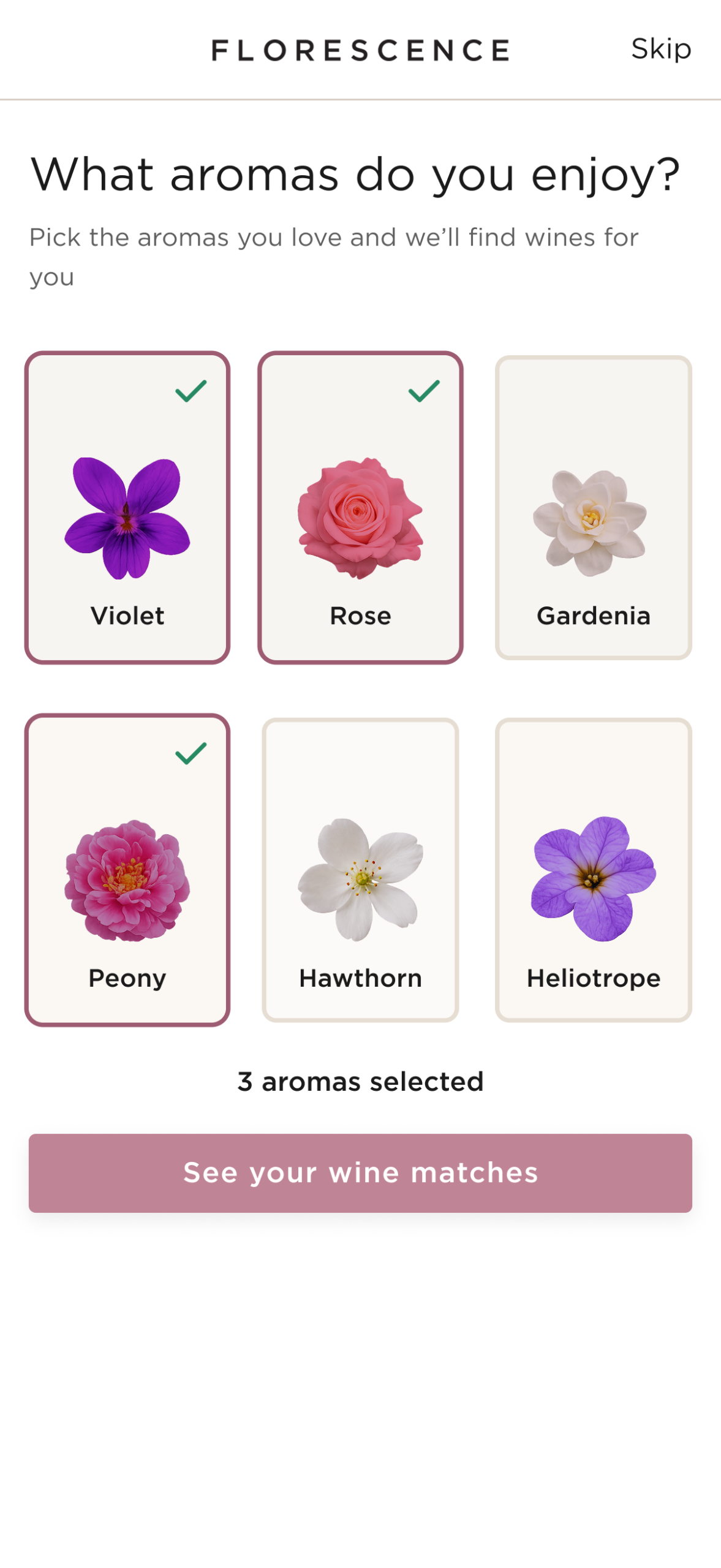
A short onboarding identifies user preferences through aroma selection, generating personalized profiles.
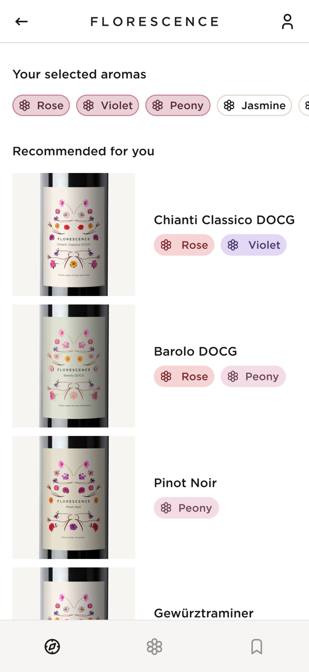
Recommendations are displayed using color-coded aroma profiles and structured product cards, enabling quick comparison.
Users can:
• Start with a guided quiz to identify taste preferences • Discover wines tailored to their profile • Compare products visually through aroma distributions • Access detailed product pages with simplified attributes
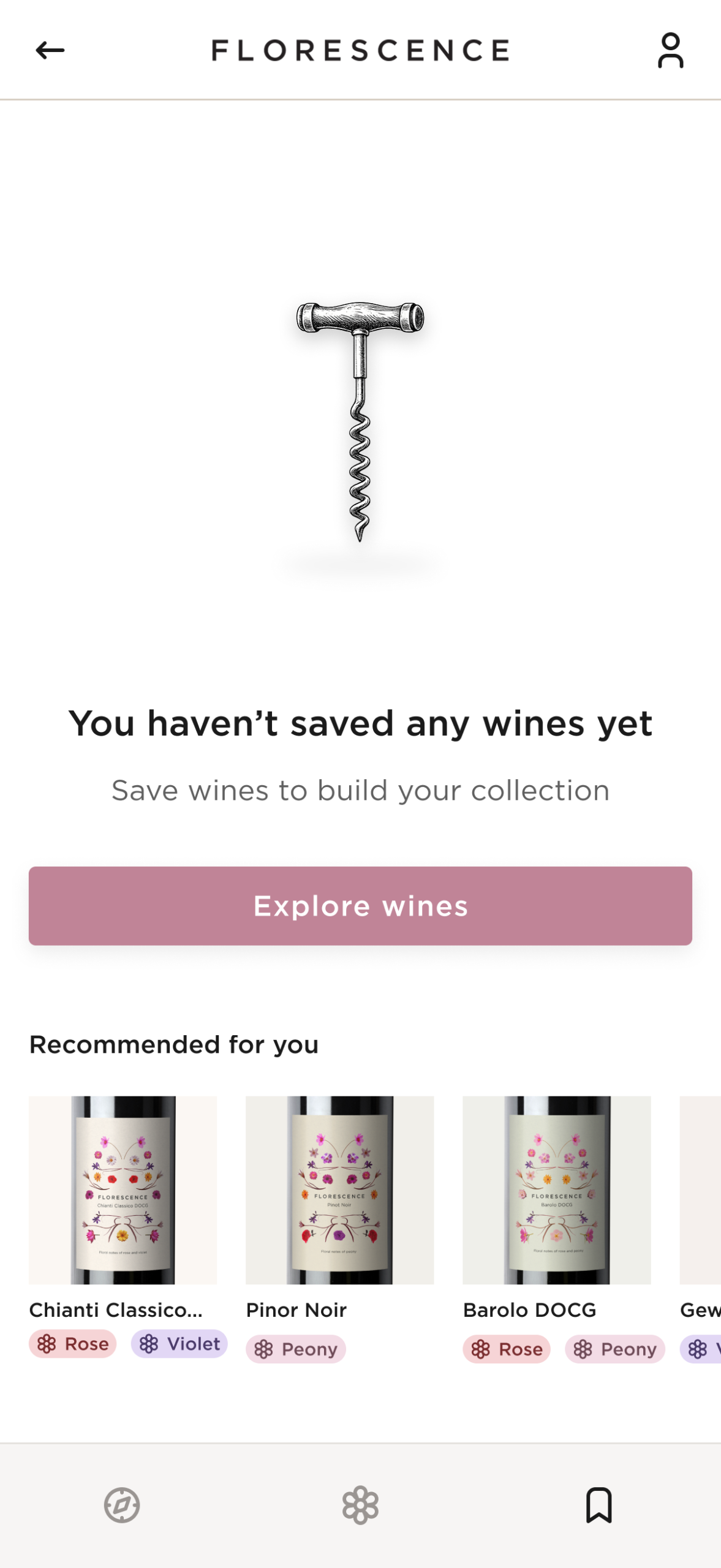
Mobile Experience
Designed for fast, on-the-go wine discovery, prioritizing speed and clarity
The interface prioritizes efficiency and simplicity:
• Key actions are reachable within the thumbzone • Navigation is organized into a small set of primary tabs • Product information is structured in progressive disclosure layers
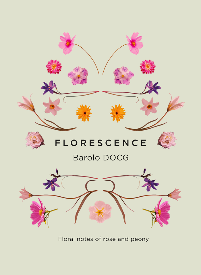
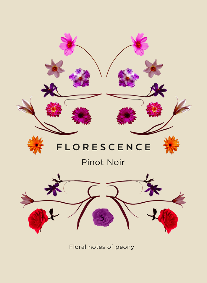
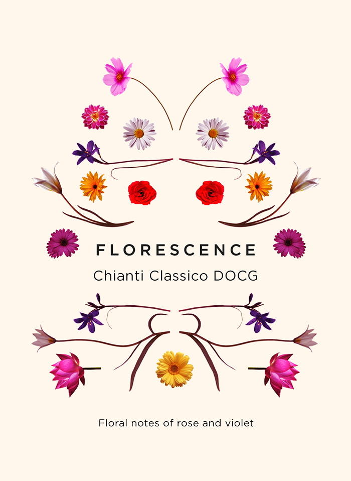
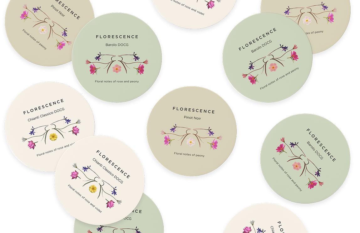
wine labels design
Translating digital aroma profiles into a physical visual system, ensuring consistency between product and digital experience
Visual system
Unified visual language connects digital and physical experiences
Aroma profiles translated into structured floral compositions
Consistent layout system ensures recognition across variants
User understanding & decision making
Visual hierarchy guides attention across key elements within each label
Consistent layouts enable comparison across wines
Familiar patterns improve recognition over time
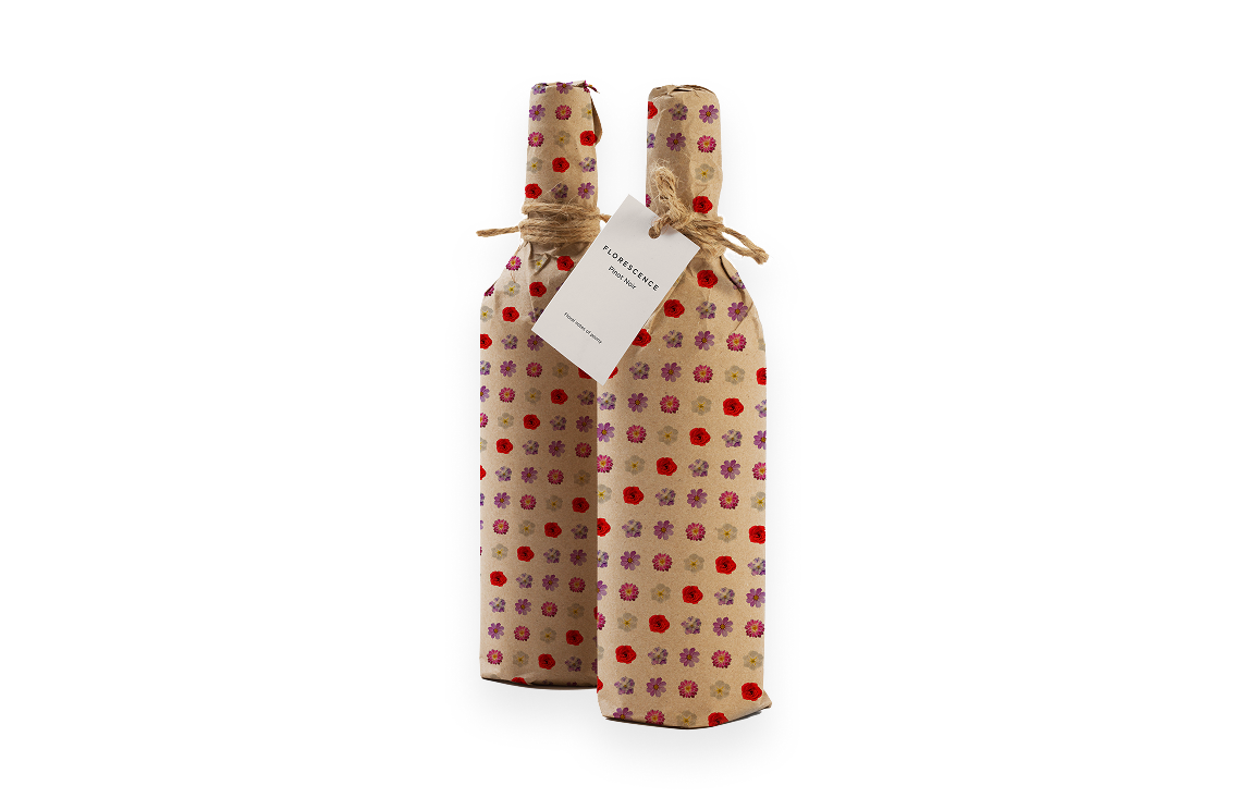
Collaterals
A set of physical assets extends the Florescence system beyond digital, maintaining consistency across touchpoints
Scales across formats
Adapts into patterns and compositions
Reinforces recognition
Key Outcomes
Results of an end-to-end design system created to support aroma-based discovery and personalized wine recommendations
Strategic Outcomes
Defined a scalable aroma-based classification system
Standardized wine representation across digital and physical touchpoints
Reduced reliance on technical wine knowledge
Created a flexible system adaptable to new categories and products
LEARNING EXPERIENCE
Enables fast discovery (decision in under 30 seconds)
Makes wine exploration accessible to non-expert users
Supports quick product comparison through visual profiles
Builds a distinctive visual language that enhances memorability