Designing the digital experience for a travel magazine dedicated to slow exploration and hidden destinations
Neverland is a travel magazine for curious travelers seeking destinations beyond the typical tourist routes. The magazine exists in both print and digital formats and targets readers who value thoughtful travel, cultural depth and authentic experiences.
The challenge was to translate the magazine’s editorial identity into a digital experience that supports long-form storytelling, curated destinations and thematic exploration, while maintaining a calm and immersive browsing experience aligned with the philosophy of slow travel.
MY ROLE
• Defined UX and visual direction for a digital editorial experience • Structured information architecture and content hierarchy for long-form reading • Designed editorial layouts bridging print and digital storytelling • Delivered high-fidelity prototypes and interaction patterns
THE RESULT
• Transformed a print-first concept into a cohesive digital experience • Improved content discoverability through clear structure and navigation • Created an immersive reading flow optimized for long-form storytelling • Built a scalable design system supporting editorial growth
SERVICES
UX/UI Design · Information Architecture · Editorial Layout Design · Wireframing · Prototyping · Responsive · Design WordPress Development
TOOLS
Figma · FigJam · Jira · Adobe CC · Notion · Google Drive
COLLABORATORS
Editorial Team · Content Creators · Developers
PROJECT DURATION
4 Months
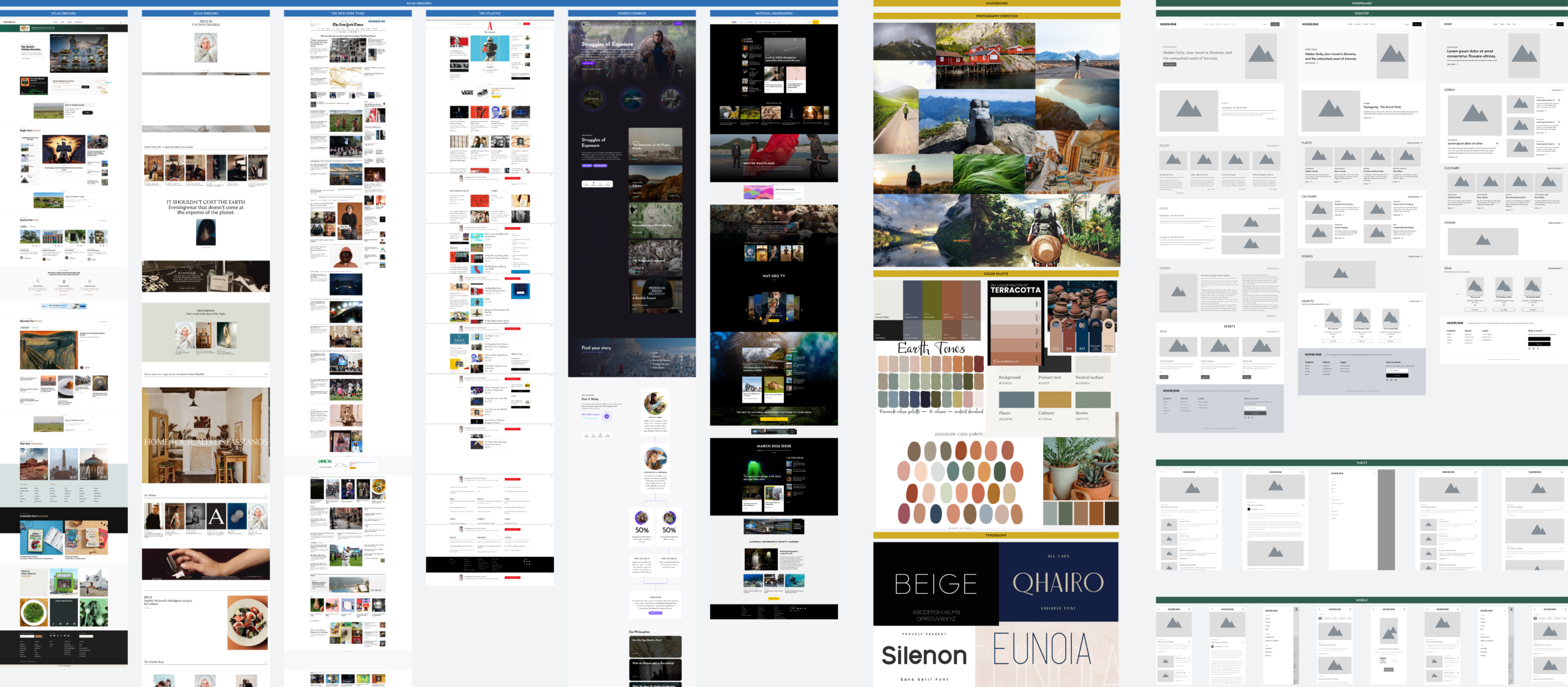
Design Exploration
Exploring layout, hierarchy, and visual direction through iteration
This workspace documents the early design explorations that helped define the visual direction, layout structure and editorial experience of Neverland.
Key design decisions:
Homepage layout explorations
Editorial grid and article structure
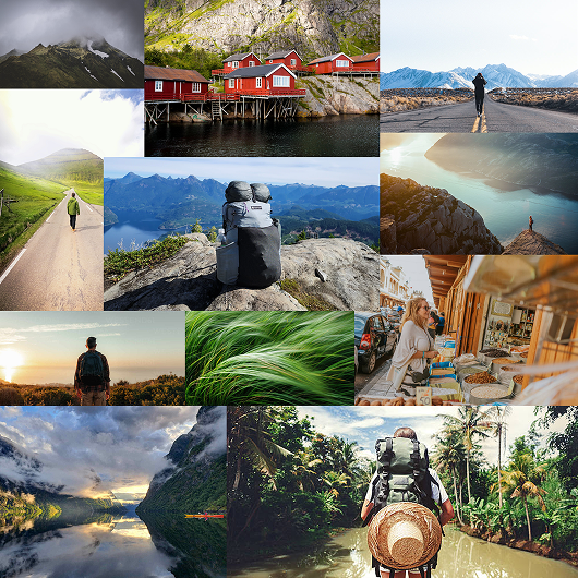
Moodboard and photography direction
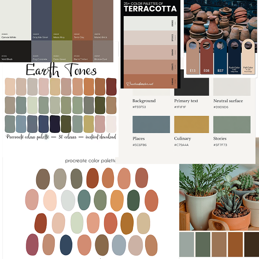
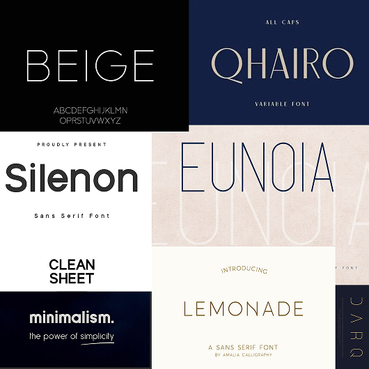
Color palette and typography exploration
Early wireframe studies
Editorial Foundations
The key visual and structural elements defining the final experience
VISUAL DIRECTION
Moodboards and visual references defined the photographic style of the magazine, emphasizing remote landscapes and quiet exploration
Color Palette
A minimal editorial palette and clean typographic hierarchy were developed to create a calm and sophisticated reading experience
Typography System
A consistent typographic system designed for long-form editorial reading, thoughtfully and effectively balancing hierarchy and readability
LAYOUT STRUCTURE
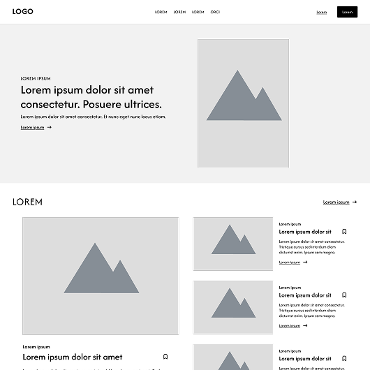
Early wireframes were used to explore the structure of homepage and article layouts, focusing on readability and editorial hierarchy
Homepage
Designing a flexible entry point that highlights stories, destinations, and curated content
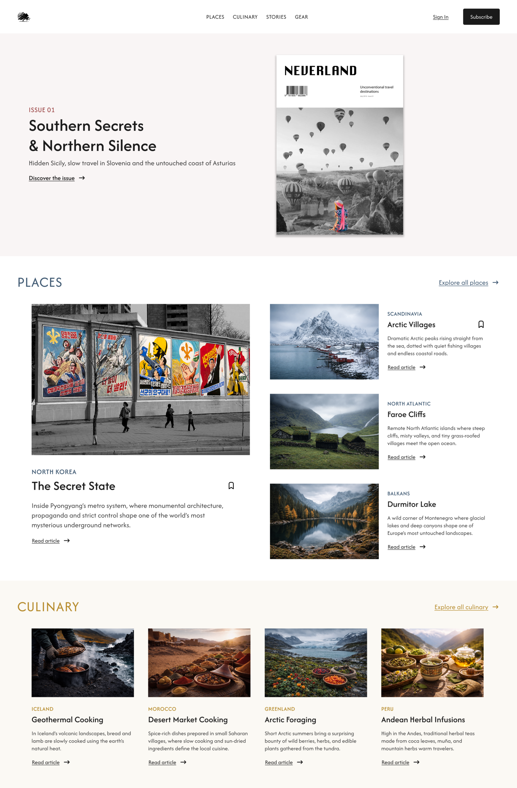
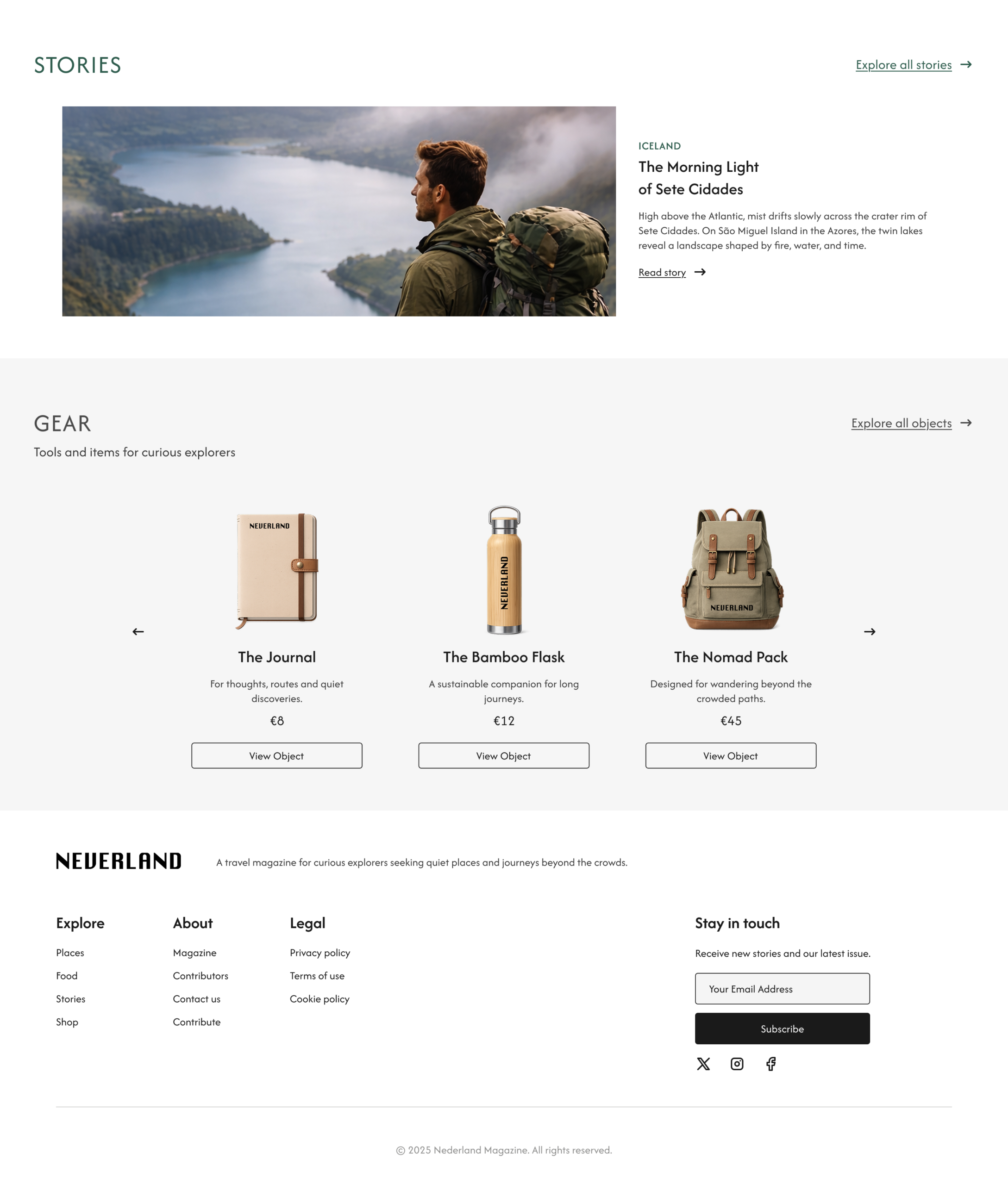
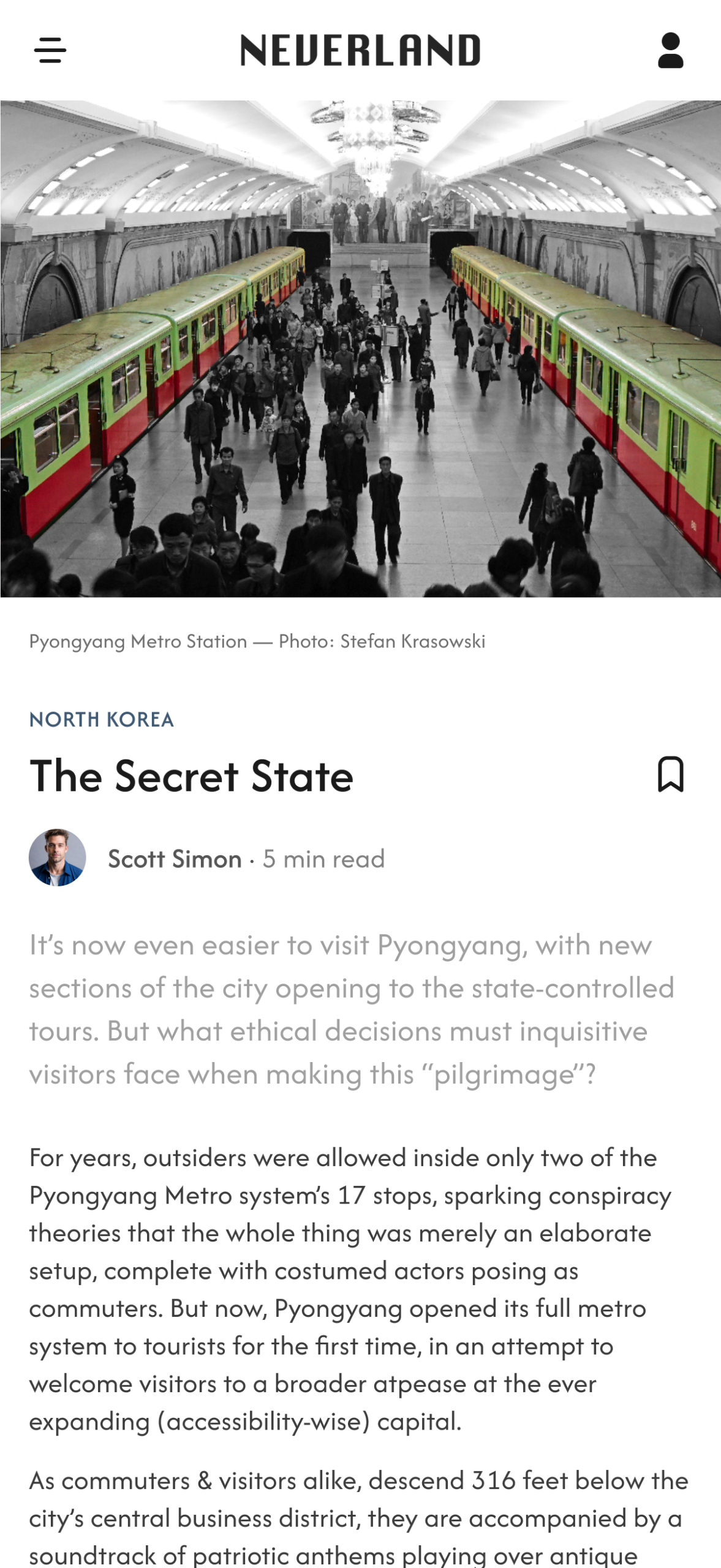
The homepage introduces Neverland as an editorial travel platform for curious travelers seeking quiet destinations and meaningful experiences beyond mass tourism.
Inspired by the structure of independent travel magazines, the layout combines immersive photography with a clear editorial grid, guiding users through destinations, stories and curated content while maintaining a calm reading experience.
Key design decisions:
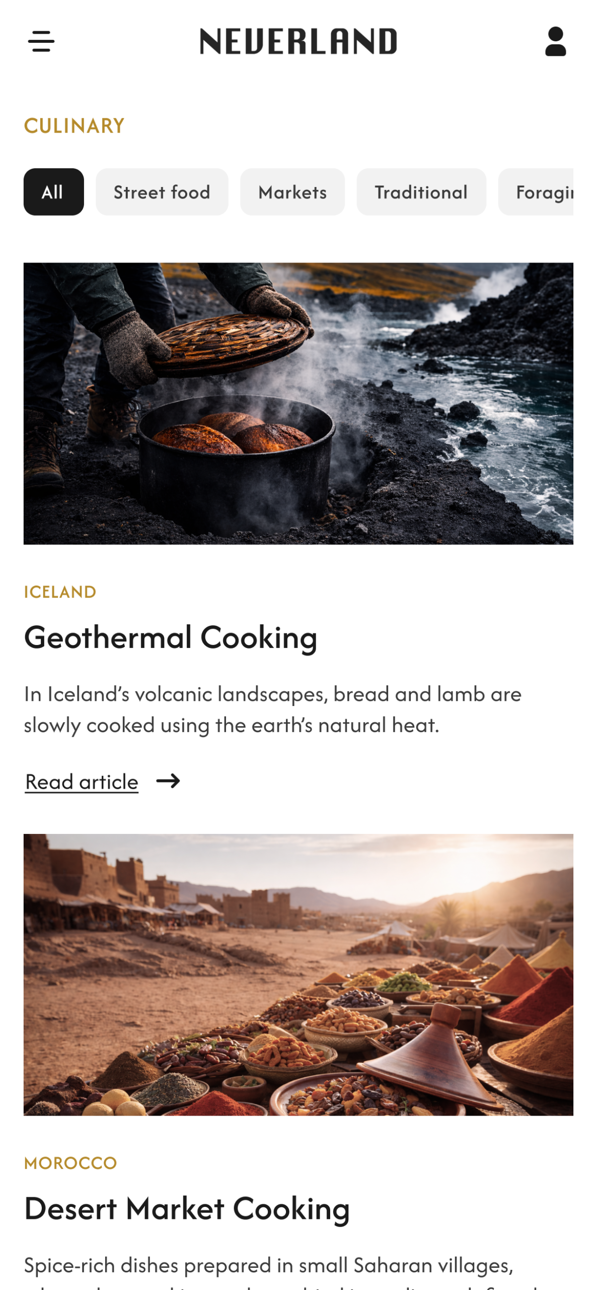
• A strong editorial hero introduces the latest issue and sets the tone for discovery • A modular grid organizes places, stories and culinary experiences into clear, scannable sections • Large immersive imagery highlights remote landscapes and reinforces the feeling of discovery • Generous spacing and minimal interface elements create a calm browsing experience • A consistent editorial hierarchy helps users navigate between long-form stories, destinations and curated content
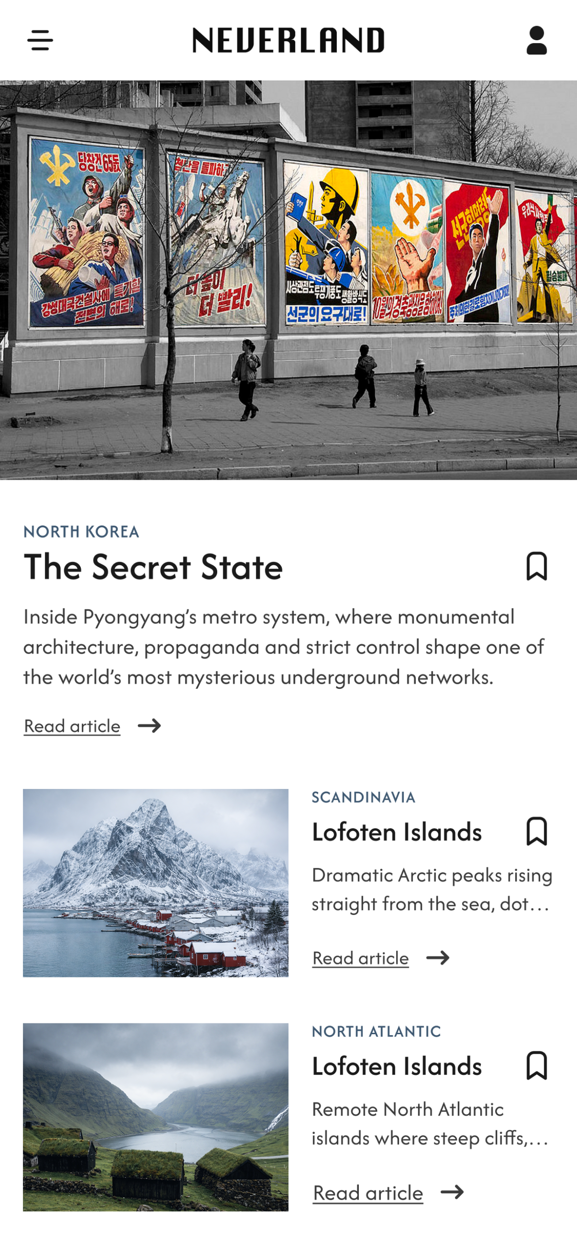
Mobile App
Adapting the editorial experience for seamless and immersive mobile browsing
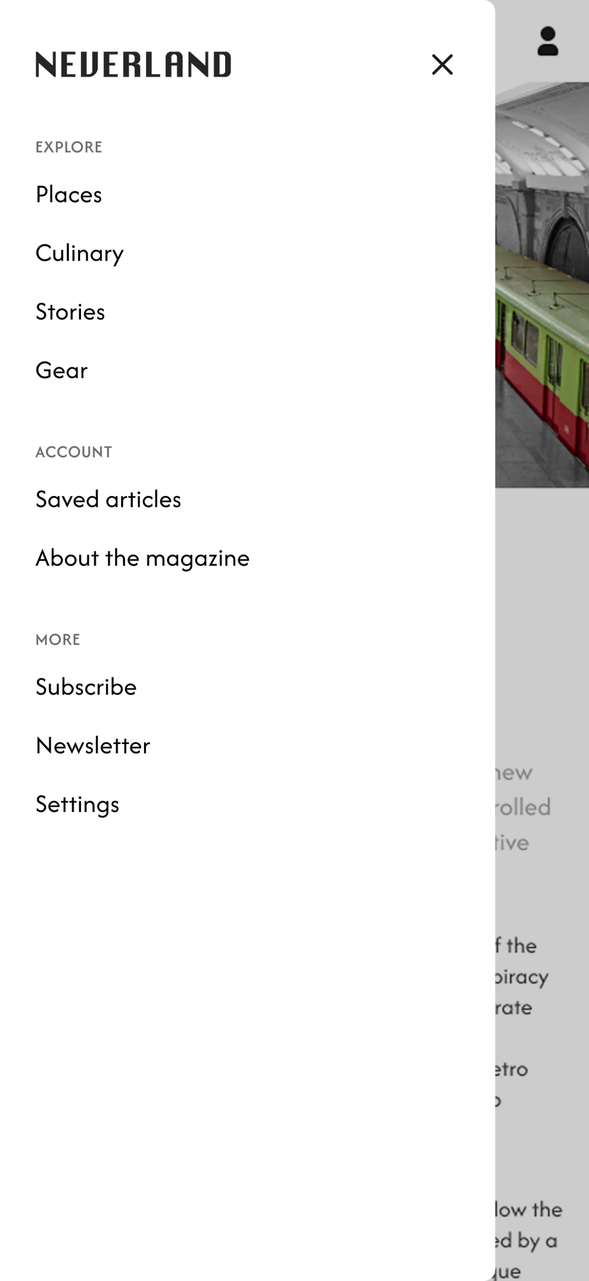
Key mobile considerations
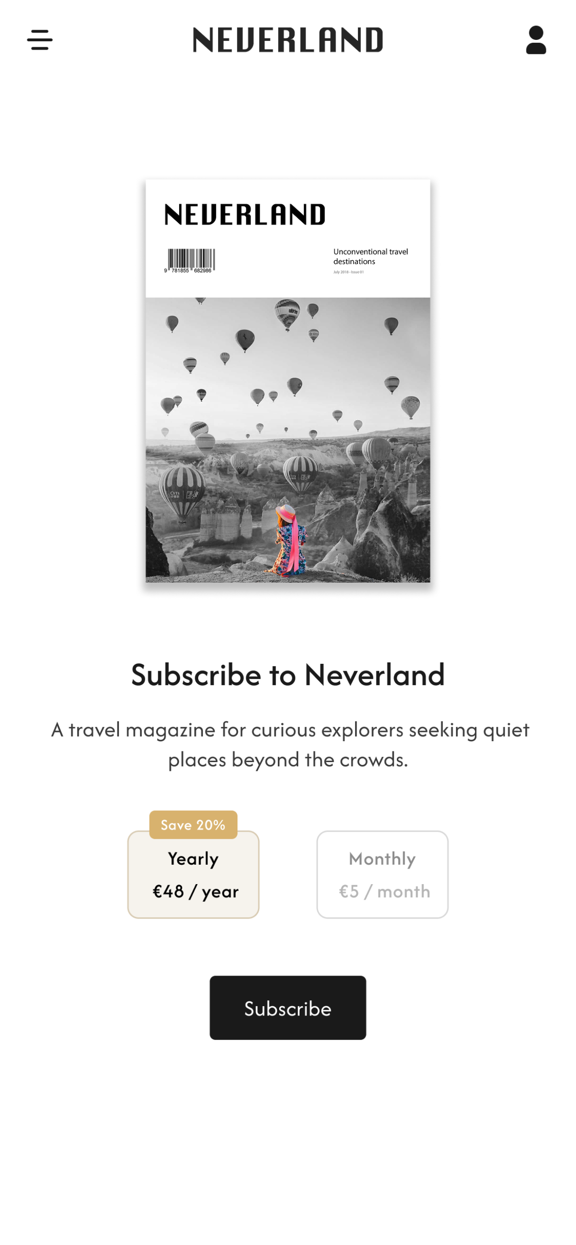
• A streamlined navigation menu provides quick access to the main sections of the magazine • Modular content cards make destinations and stories easy to browse and discover • Large editorial imagery preserves the immersive feel of the magazine on mobile • A clean reading layout supports long-form articles and comfortable scrolling • The subscription flow is simplified to encourage quick access to premium content
Editorial Design
Crafting a cohesive editorial system that balances storytelling, hierarchy, and readability
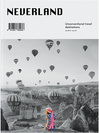
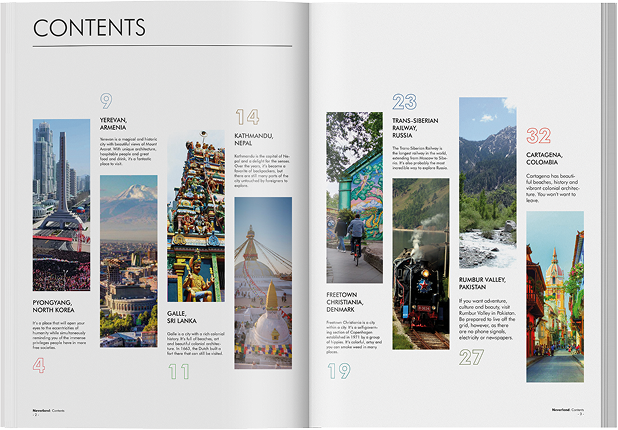
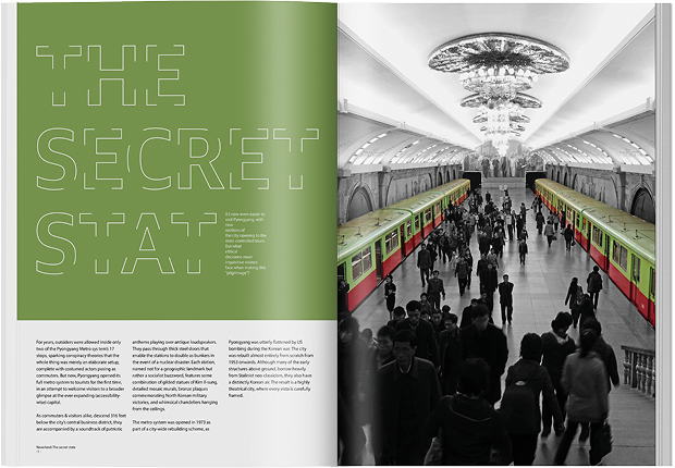
• A strong cover design introduces the magazine’s identity and visual tone and immediately sets the mood for the issue • The contents page organizes destinations through a clear editorial hierarchy, helping readers quickly navigate the stories • Opening spreads combine large imagery and expressive typography to immerse readers in each destination from the first glance
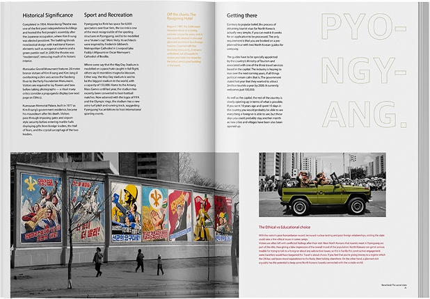
• Article layouts balance text and photography to maintain readability while supporting long-form travel storytelling • Accent colors and selective color photography highlight key elements and reinforce the magazine’s visual identity
Key Outcomes
Results of the editorial design system created to support immersive storytelling and long-form travel narratives
Strategic Outcomes
A cohesive editorial identity reflecting the magazine’s focus on unconventional travel destinations
A structured visual system designed to guide readers through long-form travel stories
A clear editorial hierarchy that supports intuitive navigation between destinations and features
A balanced use of photography, typography, and white space to create an immersive reading experience
A flexible layout framework adaptable to different types of travel narratives and visual content
Performance Impact
Strong readability across long-form travel articles through consistent layouts
High visual engagement through the integration of large-scale imagery and expressive typography
Easy content exploration supported by a clear contents page and editorial hierarchy
Immersive storytelling through opening spreads introducing each destination
A distinctive visual language that defines the magazine’s identity